
Best Color Combinations for Checkerboard Tile Floors

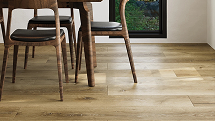
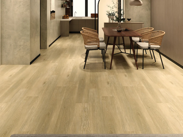
Checkerboard tile floors have become one of the most versatile design choices for kitchens, bathrooms, laundry rooms, mudrooms, patios, and entryways. Classic black and white checkerboard tile is still timeless, but today’s strongest looks also include soft neutrals, warm terracotta tones, earthy porcelain pairings, glossy ceramic wall tile, and marble look porcelain checkerboard designs.
The right checkerboard tile color combination can completely change the mood of a room. Grey and charcoal can feel bold and architectural. White and taupe can feel soft and organic. White and terracotta adds warmth. Avorio and biscotto creates a calm neutral floor, while Calacatta and Nero marble look porcelain gives the pattern a classic stone-inspired appearance.
The best color pairing depends on the room, lighting, tile size, finish, grout color, and surrounding materials. Start with Tile Mart’s checkerboard tile collection to compare porcelain, ceramic, anti-slip porcelain, decorative star and cross, and marble look porcelain checkerboard options in one place.
Quick Answer: What Are the Best Checkerboard Tile Color Combinations?
The best checkerboard tile color combinations include white and taupe, grey and charcoal, white and terracotta, avorio and biscotto, avorio and grigio, biscotto and cotto, white and charcoal, Antic and Teja, and Calacatta and Nero marble look porcelain.
For a modern checkerboard floor, choose balanced contrast, matte finishes, warmer undertones, and tile sizes that fit the scale of the room. Softer pairings usually feel more current than high-contrast layouts, while larger formats can make the pattern feel cleaner and more open.

Why Color Choice Matters in Checkerboard Tile
Color has a major impact on how checkerboard tile feels in a space. The same pattern can look traditional, modern, dramatic, minimalist, rustic, or Mediterranean-inspired depending on the two colors you choose.
High-contrast combinations create stronger visual movement. Softer tonal combinations feel calmer and more architectural. Warm colors tend to feel inviting, while cooler palettes create a cleaner and more contemporary look.
Natural lighting also changes how checkerboard tile appears throughout the day. In bright rooms, soft neutrals can help maintain warmth. In darker spaces, lighter combinations may help the room feel more open.
The goal is not simply choosing two colors that contrast. The goal is choosing a checkerboard tile combination that works with the room’s cabinetry, walls, counters, fixtures, furniture, and grout color.
White and Taupe Checkerboard Tile
White and taupe checkerboard tile is one of the strongest modern alternatives to traditional black and white flooring. The softer contrast creates movement without overwhelming the room, making it easier to pair with wood cabinetry, neutral walls, brass fixtures, and natural textures.

Stage 4x4 Checkerboard Matte Porcelain Tile in White and Taupe works especially well in bathrooms, laundry rooms, warm minimalist kitchens, mudrooms, and entryways. Because the contrast is subtle, the pattern feels layered and refined rather than overly graphic.
Design Tips for White and Taupe Checkerboard Tile
- Pair with oak, walnut, or warm wood cabinetry.
- Use brass, brushed nickel, or simple black fixtures.
- Choose warm white or cream wall colors instead of cool bright white.
- Use a soft neutral grout when you want the checkerboard pattern to feel calmer.
Grey and Charcoal Checkerboard Tile
Grey and charcoal checkerboard tile creates a more architectural look while still feeling cleaner than a sharp black and white pattern. This combination works especially well in modern bathrooms, mudrooms, foyers, laundry rooms, and monochromatic interiors.

Stage 4x4 Checkerboard Matte Porcelain Tile in Grey and Charcoal is a strong choice when you want a darker checkerboard tile that pairs with black accents, concrete textures, simple cabinetry, and modern lighting.
Design Tips for Grey and Charcoal Checkerboard Tile
- Pair with matte black hardware for a modern look.
- Use soft grey grout to avoid outlining every tile too strongly.
- Add wood, linen, or warm metal accents to soften the palette.
- Use in mudrooms or entries when you want a grounded, practical-looking floor.
White and Terracotta Checkerboard Tile
White and terracotta checkerboard tile feels warm, relaxed, and Mediterranean-inspired. It works especially well in spaces with natural textures, plaster-look walls, warm woods, woven accents, and aged metal finishes.

Stage 4x4 Checkerboard Matte Porcelain Tile in White and Terracotta softens the checkerboard pattern and creates a warmer alternative to cooler monochromatic palettes. For more 4x4 matte porcelain pairings, browse Stage Checkerboard Tiles.
Design Tips for White and Terracotta Checkerboard Tile
- Pair with cream walls instead of stark white walls.
- Use with limestone look, travertine look, or plaster-look surfaces.
- Add natural woven textures for a relaxed kitchen, patio, or laundry room.
- Keep surrounding finishes simple so the color remains the focal point.
Avorio and Biscotto Checkerboard Tile
Avorio and biscotto checkerboard tile is ideal when you want a warm neutral floor with subtle contrast. This combination feels soft, elevated, and timeless, especially in larger rooms where the checkerboard pattern has space to breathe.

Amuri 24x24 Checkerboard Matte Porcelain Tile in Avorio and Biscotto creates fewer grout lines than smaller formats, which helps the pattern feel cleaner and more seamless. The Amuri Checkerboard Tiles collection also includes 8x8 and 24x24 matte porcelain formats in warm neutral pairings.
Design Tips for Avorio and Biscotto Checkerboard Tile
- Use larger tile sizes for a cleaner floor rhythm.
- Pair with warm white walls and natural oak cabinetry.
- Avoid overly cool paint colors that fight the warm undertone.
- Use in kitchens, open floor plans, entryways, and larger bathrooms.
White and Charcoal Checkerboard Tile
Classic black and white checkerboard tile remains iconic, but a white and charcoal pairing gives a similar high-contrast look with a softer matte porcelain finish. It works well when you want a statement floor without making the room feel overly retro.

Stage 4x4 Checkerboard Matte Porcelain Tile in White and Charcoal works well in kitchens, entries, powder rooms, and statement spaces. For glossy black and white checkerboard wall tile, explore Village Checkerboard Tiles.
Design Tips for White and Charcoal Checkerboard Tile
- Use clean cabinetry and simple hardware to balance the contrast.
- Keep other patterns minimal so the checkerboard tile feels intentional.
- Use matte finishes for a softer modern look.
- Choose a grout color that supports the pattern without making it too busy.
Warm Earth-Tone Checkerboard Tile
Warm earth-tone checkerboard tile creates a more organic look than cooler monochromatic combinations. Biscotto, cotto, Antic, Natural, Teja, terracotta, and brown tones work well with walnut wood, linen fabrics, plaster-look walls, and aged brass.

Amuri 24x24 Checkerboard Matte Porcelain Tile in Biscotto and Cotto is a strong choice for larger spaces that need warmth and movement without harsh contrast. For more warm neutral porcelain options, compare the full Amuri Checkerboard Tiles collection.
Outdoor and Patio Checkerboard Tile Colors
For patios, covered terraces, wet areas, and outdoor dining spaces, earthy checkerboard colors usually feel more natural than stark black and white. Fuego Checkerboard Tiles offer 9x9 R11 matte porcelain options in warm Antic, Natural, and Teja pairings.

Fuego 9x9 Checkerboard R11 Matte Porcelain Tile in Natural and Teja is another warm option for patios and covered outdoor areas. Browse Fuego Checkerboard Tiles to compare the full collection.
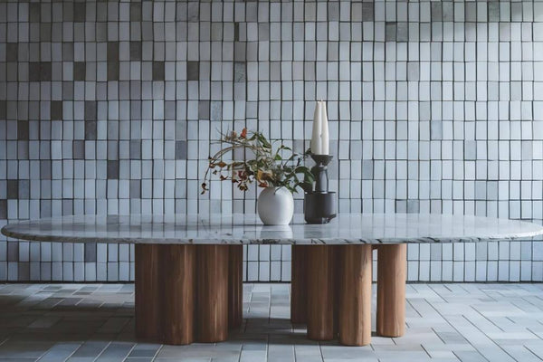
Marble Look Checkerboard Tile Colors
Marble look porcelain checkerboard tile gives the pattern a classic stone-inspired appearance while keeping the material porcelain. Palazzo Checkerboard Tiles include 12x12 and 24x24 marble look porcelain options in combinations such as Calacatta and Nero, Calacatta and Crema, Crema and Nero, Verde and Calacatta, and Luce pairings.

For stone-inspired checkerboard floors and walls, explore Palazzo Checkerboard Tiles. This is the best collection to link when discussing marble look checkerboard tile.
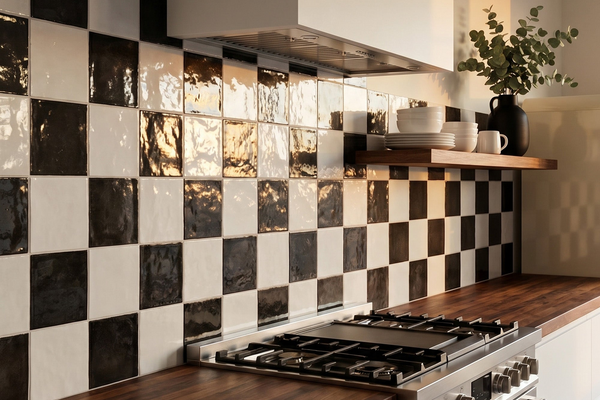
Glossy Checkerboard Wall Tile Colors
Checkerboard tile is not limited to floors. Glossy ceramic checkerboard tile can bring color, shine, and personality to backsplashes, bathroom walls, powder rooms, and decorative surfaces.

For backsplashes, bathrooms, and decorative wall surfaces, browse Village Checkerboard Tiles. The collection includes 5x5 glossy ceramic checkerboard options in soft, colorful, and high-contrast pairings.
Decorative Star and Cross Checkerboard Colors
Checkerboard tile does not always need to use standard square tiles. Star and cross checkerboard patterns create a decorative effect with more movement and personality. These designs work especially well in statement spaces, powder rooms, bathrooms, and accent areas.

For decorative checkerboard color pairings, compare Amalfi Checkerboard Tiles and Kasbah Checkerboard Tiles.
Choosing the Right Checkerboard Colors for Each Room
| Room | Best Color Direction | Collection to Explore |
|---|---|---|
| Kitchen | Warm neutrals, avorio, biscotto, taupe, white and charcoal | Amuri Checkerboard Tiles |
| Bathroom | White and taupe, white and grey, marble look porcelain, soft neutrals | Stage Checkerboard Tiles |
| Mudroom | Grey and charcoal, white and charcoal, darker porcelain pairings | Stage Grey and Charcoal Checkerboard Tile |
| Entryway | Large-format neutrals, Calacatta and Nero, Verde and Crema | Palazzo Checkerboard Tiles |
| Patio | Antic, Natural, Teja, terracotta, warm earth tones | Fuego Checkerboard Tiles |
| Backsplash | White and mint, white and cloud, white and black, colorful glossy ceramic | Village Checkerboard Tiles |
How Grout Color Affects Checkerboard Tile
Grout color can completely change how checkerboard tile looks. A strong contrasting grout makes the pattern more graphic and defined. A softer grout creates a more blended and elevated appearance.
For most modern interiors, warm beige grout works well with taupe, biscotto, and terracotta tones. Soft grey grout pairs well with charcoal, grey, and white combinations. Neutral grout tones help soften contrast when you do not want every tile edge to stand out.
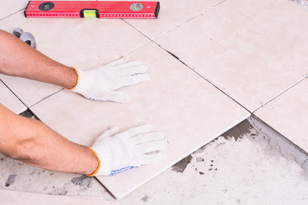
Always review grout samples next to the actual tile before installation. The same checkerboard color combination can look very different depending on grout tone, joint size, lighting, and surrounding finishes.
Matte vs Glossy Checkerboard Tile
Finish matters just as much as color. Matte checkerboard tile usually feels softer and more modern on floors, while glossy checkerboard tile works well for walls, backsplashes, bathrooms, and decorative surfaces.
Matte porcelain checkerboard tile can reduce glare and create a calmer appearance. For outdoor areas, patios, and wet areas, choose a tile designed for that setting, such as Fuego Checkerboard Tiles with R11 matte porcelain options.
Glossy ceramic checkerboard tile, such as options from Village Checkerboard Tiles, is better suited for backsplashes, bathrooms, walls, and decorative surfaces where shine and color are part of the design.
Best Checkerboard Tile Color Pairings to Shop
| Color Combination | Best For | Tile Mart Option |
|---|---|---|
| White and Taupe | Soft bathrooms, laundry rooms, kitchens, and organic modern spaces | Stage White and Taupe Checkerboard Tile |
| Grey and Charcoal | Mudrooms, entries, contemporary bathrooms, and bolder floors | Stage Grey and Charcoal Checkerboard Tile |
| White and Terracotta | Warm kitchens, laundry rooms, and Mediterranean-inspired spaces | Stage White and Terracotta Checkerboard Tile |
| Avorio and Biscotto | Large kitchens, entryways, open floor plans, and warm neutral interiors | Amuri Avorio and Biscotto Checkerboard Tile |
| Biscotto and Cotto | Earthy spaces, transitional kitchens, and warm modern interiors | Amuri Biscotto and Cotto Checkerboard Tile |
| Antic and Teja | Patios, wet areas, covered terraces, and outdoor dining spaces | Fuego Antic and Teja Checkerboard Tile |
| Calacatta and Nero | Classic marble look porcelain checkerboard floors and walls | Palazzo Checkerboard Tiles |
| White and Mint | Glossy checkerboard backsplashes, bathrooms, and decorative walls | Village White and Mint Checkerboard Tile |
How to Choose a Checkerboard Tile Combination That Feels Timeless
The most timeless checkerboard floors usually avoid extremes. Softer contrasts, warmer undertones, matte finishes, and larger tile formats tend to age better than highly graphic combinations.
For a more modern checkerboard look, choose warmer colors, avoid overly shiny surfaces on floors, use fewer grout lines where possible, pair the floor with simple surrounding materials, and focus on balance instead of high contrast.
Checkerboard tile should feel integrated into the room instead of overpowering it. The best results come from matching the tile color, finish, size, and grout to the way the room will actually be used.
Shop Checkerboard Tile by Collection
Use these Tile Mart checkerboard collections to narrow the look by material, size, finish, color, and room use:
- Checkerboard Tile Collection for the full assortment of checkerboard floor and wall tile options.
- Stage Checkerboard Tiles for 4x4 matte porcelain checkerboard bundles in multiple color combinations.
- Amuri Checkerboard Tiles for 8x8 and 24x24 matte porcelain checkerboard tile in warm neutral pairings.
- Fuego Checkerboard Tiles for 9x9 R11 matte porcelain checkerboard tile for patios, wet areas, and spaces needing added grip.
- Kasbah Checkerboard Tiles for decorative star and cross matte porcelain checkerboard designs.
- Amalfi Checkerboard Tiles for warm star and cross matte porcelain checkerboard pairings.
- Village Checkerboard Tiles for 5x5 glossy ceramic checkerboard tile for backsplashes, walls, bathrooms, and decorative surfaces.
- Palazzo Checkerboard Tiles for marble look porcelain checkerboard tile in 12x12 and 24x24 formats.
Finding the Right Checkerboard Tile Color Combination for Your Space
The best checkerboard tile color combination depends on the mood and style you want to create. Warm neutrals can make a room feel soft and relaxed, while darker combinations create more contrast and definition. Earthy terracotta tones bring warmth and character, while classic high-contrast checkerboard remains timeless when paired with modern finishes and simple surrounding design.
Whether you prefer subtle tonal variation or a stronger statement floor, choosing the right tile size, finish, grout color, and material can help the checkerboard pattern feel balanced and elevated throughout the home.
Explore the Checkerboard Tile Collection to compare warm neutrals, matte porcelain, outdoor R11 porcelain styles, glossy ceramic wall options, decorative star and cross patterns, and marble look porcelain checkerboard tile for kitchens, bathrooms, patios, entryways, and more.
FAQs About Checkerboard Tile Color Combinations
What are the most popular checkerboard tile color combinations?
Popular checkerboard tile color combinations include white and taupe, grey and charcoal, white and terracotta, avorio and biscotto, biscotto and cotto, white and charcoal, Antic and Teja, and Calacatta and Nero marble look porcelain.
What checkerboard tile colors feel the most modern?
Warm neutral tones and softer contrasts usually feel the most modern. Avorio, biscotto, taupe, grigio, terracotta, charcoal, and soft white pairings can all feel current when used with simple surrounding finishes.
What checkerboard tile colors work best for kitchens?
For kitchens, warm neutrals such as avorio and biscotto, white and taupe, biscotto and cotto, and white and charcoal are strong options. Larger formats from the Amuri collection can create a cleaner look in open kitchens.
What checkerboard tile colors work best for bathrooms?
White and taupe, white and grey, grey and charcoal, marble look porcelain, and soft neutral checkerboard tile combinations work well in bathrooms because they add pattern while staying easy to style with simple wall tile and fixtures.
Does grout color affect checkerboard tile?
Yes. Grout color can either soften or emphasize the checkerboard pattern. For a modern look, choose a grout color that blends with both tile colors instead of sharply outlining every tile.
Can checkerboard tile be used outdoors?
Yes, but the tile must be suitable for the outdoor location. For patios, covered terraces, and wet areas, explore Fuego Checkerboard Tiles, which include 9x9 R11 matte porcelain checkerboard options in warm outdoor-friendly color pairings.
::: 


