


Education

Quick Summary
Ceramic tile color plays a major role in shaping the mood, brightness, and perceived size of a room. Light shades can make spaces feel larger and more open, while darker tones add depth and contrast. The most effective color choices take into account natural light, room function, existing décor, and long-term design flexibility, helping create spaces that remain attractive and practical for years.
Color sets the tone before anything else in a room. The ceramic tile colors you pick can make a small room feel open, a dark room feel bright, or a plain space feel warm. At Tile Mart, our ceramic tile selection spans soft neutrals, bold darks, and every shade in between. Knowing what works best in each room helps narrow things down.
Why Color Matters In Tile
Tile stays put for years. Unlike paint, tile is a longer-term choice. That makes color a key part of the decision.
Light colors bounce light around and make a room feel larger. Dark colors ground a space and add depth. Neutral shades offer flexibility and let you switch decor without clashing. Bold colors create a focal point. The finish matters too. Glossy tiles reflect light and brighten colors. Matte tiles give a softer, more muted look.
Best Colors For Kitchens
Kitchens are busy spaces that handle heat, moisture, and spills. Tile here needs to look good and hold up well.

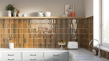
Mallorca White 2X8 Matte Ceramic Tile — browse the Mallorca collection
White And Cream
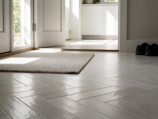
White or cream floor tiles keep the room feeling clean and open. They pair with any cabinet color. Cream adds warmth without losing brightness.
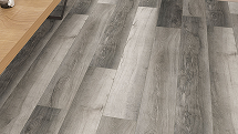
Warm Gray And Greige
Gray with warm undertones hides crumbs and light debris better than pure white. It works with stainless steel, wood, and painted cabinets alike.
Soft Blue And Green
For a backsplash, soft blue or sage green adds a calm, natural touch. These shades feel fresh without being loud. We see many customers browsing our kitchen tiles for these exact hues.
Best Colors For Bathrooms
Bathrooms are personal spaces where you want to feel relaxed, and the right bathroom tiles set that tone before anything else.

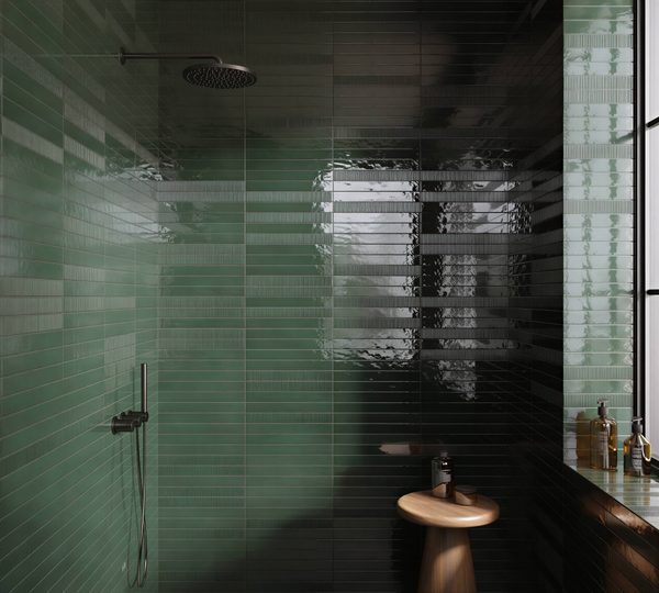
Village Cloud 2.5X8 Glossy Ceramic Subway Tile
Spa Blues And Aquas
Light blue and aqua shades mimic water and sky. They create a calm feeling and work well on shower walls or behind a vanity.
Warm Sand And Beige
Beige tones add warmth without darkening the room. They hide water spots and dust better than very dark or very light tiles.
Charcoal And Slate
For drama, charcoal tile on a floor or accent wall adds depth. Pair it with light walls and good lighting to avoid a closed-in feeling.
Best Colors For Living Spaces
Living rooms and open areas connect the home. Tile should flow with nearby spaces.
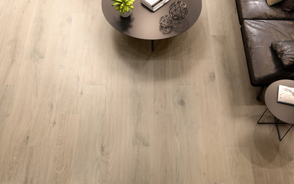
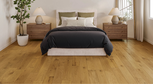
Warm Wood-Look Tones
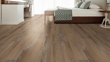
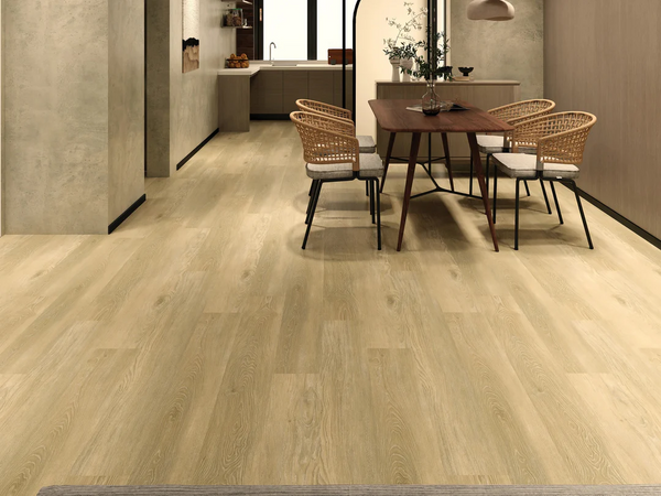
Ceramic tile that mimics wood comes in pale oak to rich walnut. These browns give the look of hardwood with the strength of tile.

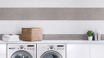
Village Mushroom 2.5X8 Glossy Ceramic Subway Tile — browse the Village collection
Soft Taupe And Mushroom
Mid-range neutrals between gray and brown add warmth without pulling too yellow or cool. They pair well with most furniture styles.
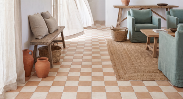
Terracotta And Clay
For Mediterranean or Southwestern homes, terracotta tile brings earthy warmth. It pairs well with wood beams, woven rugs, and plants.
Best Colors For Entryways
Entryways take the brunt of dirt, rain, and foot traffic.

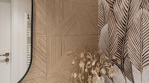
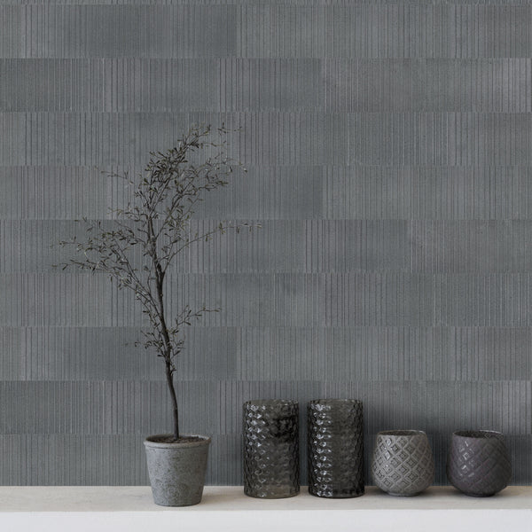
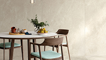
Tangram Walnut 12.2X39.37 Matte Ceramic Ribbed Panel — browse the Tangram collection
Medium Brown And Greige
Mid-tone colors hide dirt well and look welcoming. They shift easily into lighter or darker rooms.
Patterned Tiles
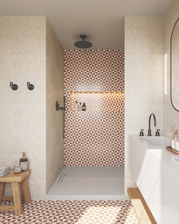
A patterned tile with small pops of blue, green, or rust adds personality. The pattern helps hide dirt between cleanings.
Pairing Tile Colors With Your Decor
Pick up on undertones in the room. Warm wood cabinets call for tile with warm undertones. Cool gray counters pair best with cool-toned tile.
Stick to three main colors per room. Tile counts as one. Cabinets and walls make up the other two. A limited palette keeps the room feeling balanced.
Always check samples in your own space. Light shifts throughout the day and changes how a color reads against your existing finishes.
Grout Color And Its Effect
Matching grout blends in for a seamless look. Contrasting grout frames each tile and highlights the layout. For a calm feel, match the grout to the tile. For a bolder statement, go lighter or darker.
The best ceramic tile colors fit how you live and how you want each room to feel. Neutrals offer flexibility. Pops of color add joy. Dark shades bring drama. Think about light, purpose, and traffic, then let those factors guide you.
FAQs
What ceramic tile colors make a small room look bigger?
Light shades like white, cream, and soft gray reflect light and open up a space. Large format tiles with thin grout lines also help.
Are dark tile floors hard to keep clean?
Dark tiles can show dust and pet hair more than mid-tones. Regular sweeping helps. A matte finish hides small marks better than gloss.
Do ceramic tile colors fade over time?
Quality glazed ceramic holds its color well. The glaze resists fading from sunlight and cleaning products. Proper care keeps it looking fresh for years.
Can I mix different tile colors in one room?
Yes. Use a neutral field tile and add a decorative border or accent strip in a contrasting shade. Keep the palette limited so the room stays cohesive.